
You might have noticed that something’s different. Things are looking a bit more sleek, a lot more sexy and a whole lot more awesome at everyone’s favorite site: StackSocial! We’re excited to announce that your go-to destination to discover the latest innovative and trending tech just had a bit of a makeover we’re hoping you’ll love.
You spoke and we listened. We’ve optimized the look and feel of our homepage, product pages and the entire mobile experience. We’ve overhauled our navigation and usability. We’ve added new features like elastic search and dynamic collections that are automatically populated based on the actions you take on the site (takes a deep breath)…
And the final result: the same great deals on your favorite apps, gadgets, courses, games and more, in a more intuitive, easy-to-navigate interface that seamlessly personalizes your experience and makes discovery a breeze.
It doesn’t end there – we will continue to iterate, test and most importantly, take your feedback (let us know any thoughts on what you like or don’t like in the comments below) to make continuous improvement.
And just because our refreshed look might turn a few more heads, and we may walk with a bit more swag in our step, rest assured: we’re still the same ol’ curators of cool you fell in love with back in the day. We care about one thing, and one thing only: hand-picking the world’s best trending tech exclusively for Y-O-U! Check it out.
I think you guys did a GREAT SERVICE TO BUILD up your own interested clients, it isn’t that the design is Sexier it is the #Gift from the needs answered. I am launching a ecommerce site that will eliminate the barriers to get #Solar energy. I am seeking the idea to get #Community feedback , using the Before and After modeling. Sign me up.
Sorry guys but i prefer the old site look… but i really don’t know why 🙂 🙂
Just a question, where are the upcoming deal list?
I too prefer your old sight. As a result I bought a lot of stuff.
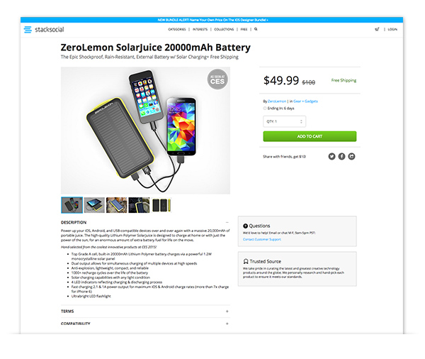
I’d have to see both sights “side-by-side” to verbalize the specific reasons why I found the layout of your old sight so much more compelling. For starters, I can tell you that the size of the print in your “mini-windows is EXTREMELY tiny, and therefore illegible. Also, listing the price of a ZeroLemon SolarJuice battery (under the heading: Latest Deal) for $4,999.00 is just sloppy editing and proofing. Shouldn’t the premier of you new web sight deserve more attention to detail?
At this point, I’m not sure if I’ll continue being a customer. I’ll give your new format a few weeks and then decide. In the mean time, I’m reminded of the cliche, “If it ain’t broke, don’t fix it.”
The headline says “Trending Tech Curated For You”. If that ‘You’ means all your customers, then it is OK. If that ‘You’ means me personally, then it is not very good, since many of your listed products are for systems or devices I do not use.
It’s terrible that I can no longer see the comments and reviews from others there (neither did I find a place to write mine). Don’t think I’ll purchase any more without that.
The old site was way better. Why do people fix what isn’t broken?
What was wrong with the old site? The old site was WAY better!!!
I prefer the older site. :L I feel like you guys tried to modernize it and it failed. Sorry.
I prefer the older site too