
With the arrival of OS X Yosemite this fall, our Macs will be receiving a serious upgrade. On the way are revamped versions of Safari and Mail, tighter iCloud integration and (eventually) a new Photos app. But the biggest change will be visual. At a glance, OS X will seem to be its usual self — but look more closely, and you’ll see 10.10’s design overhaul…
Translucency
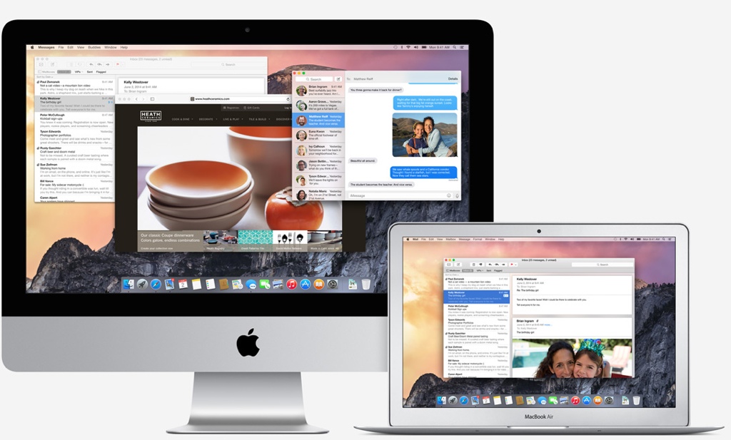
Although, most Mac owners would need no more than a glance to spot Yosemite’s translucent windows. The see-through look has been used in the Dock for a while, but this is the first time it has been utilized elsewhere, and it can now be found all over the place. Included to provide visual depth, it is a change that will no doubt split opinion, but it does tie in with Apple’s — and everyone else’s — obsession with the “flat” look.
Icons
Flatness is also the theme throughout the new icons for Apple-made apps. Finder is smilier than before, and most of the other icons have been decluttered; Safari’s compass no longer has a subtle atlas as a background, TextEdit’s notepad is missing that handwritten letter, and the Messages bubble has lost its blue stripes. Plus, the Trash-can is now made of digital translucent glass!
While I’m on the subject — we currently have a pack of 1000+ beautiful icons at a 51% discount.

Font
For the first time ever, Apple has also changed the OS X font. The familiar Lucida Grande has been switched out for the svelte Helvetica Neue, as used in iOS since version 7. You might be thinking that this is a nerdy thing to notice (it is), but as it affects the look of every word provided by the operating system, it’s a change that’s pretty…systemic, I guess.
Other Bits
And there’s more.
Notification Center is still dark, but it has been expanded with extra information, and the old slide-out drawer has been replaced by a flat panel. Meanwhile, Safari’s bookmarks bar has been hidden (by default) and replaced by a dropdown menu of favicon previews, and Mail now mirrors its iOS counterpart.
Even Spotlight, the Mac’s search engine, has been dislodged from its traditional top-right corner, now appearing as a central pop-up when triggered — a change that will feel natural to Alfred users.

It has been clear for some time that Apple wants to bring its desktop and mobile experiences closer together, and Yosemite is the biggest move they’ve made in that direction yet. Personally, I like most of the changes, although the translucency might take some getting used to…but what do you think? Let us know in the comments below.
Like design? You might want to check out our Name Your Own Price Designer Bundle of resources. Or if you’d like to get some knowhow, try our User Engagement and NYOP Learn to Design e-learning deals.
Still wanting dark mode. Maybe Dev preview 2.?
There are two other places transparency has previously been used: the menu bar and Terminal. (Though, in fairness, I don’t think it’s enabled in either by default.)
If I’m not mistaken, the menus have always been transparent, and for me the greater use of the see-through effect is a welcome change/addition since – for my taste – it’s been underused in the past. Especially when you consider that Apple introduced it way back in 2001…